

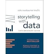
Storytelling with Data: A Data Visualization Guide for Business Professionals
Product ID: 19598729
⭐4.6/5 from 5,217 reviews
📈Ranked #4,964 in Books
📊Top #2 in Info Management
Buy anything from 5,000+ international stores. One checkout price. No surprise fees. Join 2M+ shoppers on Desertcart.
Desertcart purchases this item on your behalf and handles shipping, customs, and support to New Zealand.
📊 Turn your data into decisions with storytelling that sticks!
Storytelling with Data is a top-ranked, highly-rated guidebook designed for business professionals seeking to master data visualization. Packed with practical examples and audience-focused strategies, it empowers readers to create impactful visuals that drive informed decision-making.

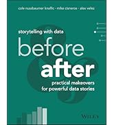
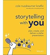

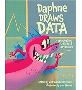
| Best Sellers Rank | #6,569 in Books ( See Top 100 in Books ) #1 in Information Management (Books) #7 in Running Meetings & Presentations (Books) #26 in Communication Skills |
| Customer Reviews | 4.6 out of 5 stars 5,285 Reviews |
J**E
A go-to reference book for data visualization
I have used this book for years as a go-to reference when I am designing visualizations that need to convey specific and targeted information effectively. It's a practical book, and easy to navigate quickly to sections that relate to what you are trying to accomplish. It's definitely worth reading through from the beginning, as a reminder of the importance of identifying audience and context before you design anything. I would recommend as a core reference book for anyone who has to regularly create visuals from data in order to get an audience into context so they can make informed decisions.
I**G
Fantastic writing on how to build sets of images
I am a university professor who teaches biostatistics and I find this to be one of the best books that bridges the gap between analytics and presentation. There are some excellent books around that show visualization (e.g., The Wall Street Journal Guide to Information Graphics: The Dos and Don'ts of Presenting Data, Facts, and Figures or books by Few Information Dashboard Design: Displaying Data for At-a-Glance Monitoring & Show Me the Numbers: Designing Tables and Graphs to Enlighten or Cairo The Truthful Art: Data, Charts, and Maps for Communication ) and there are good books on presentation (in particular I love Duarte's books Resonate: Present Visual Stories that Transform Audiences ) but this book is unique in how well it blends the two topics. I have never seen such an excellent presentation on how to build a series of graphics. That is, with books by Few or Cairo you will know how to make *a* great graphic and with advice from Duarte, you can connect with your audience but with this book you will see how to build a series of interrelated graphics that highlight different parts of a dataset. Most of the examples are spun around business but the examples are easy to extend to any field. While I think the author wrote this for people who do presentations in any quantitative field for a living, this book should be required reading for graduate students preparing to defend a dissertation or thesis.
P**E
Loved this book. Demystified working with data
I no longer feel I just need to show a bunch of slides to make an effective presentation rather, I can think through a coherent story that I want the slides to represent. Love this book
S**1
Effectiveness Through Simplicity
I work in the project controls arena of large projects that have hundreds, if not thousands of people working on them. A key requirement for project controls is to keep all project personnel informed about the project status. Needless to say engineering plays a major role on these projects and brings lots of data with them; pages and pages of it. As the author points out the analytical types are not necessarily trained on how to tell a story (i.e. communicate) with their data. For the last 10 years or so, I have developed methods for getting the project story down to a single graphic. It's usually a large graphic, but a single one. It has the effect of getting everyone on the same page. But for people who are not used to looking at this type of presentation, it can be overwhelming or as the author points out they have to work at it in order to understand it. This was a key point for me. Before I finished the book, I started making changes in my work products. They were small changes, but the feedback was very positive. One example, do you ever note information in page footers like date, time and maybe filename and path? Does anyone think to put them in the background by using a shade of gray instead of the default black? No! Try it. Then ask for opinions It doesn't sound like much, but it's reducing the competition on people's focus. This book is great! It's fairly short to read and has a lot of examples making it easy to follow the author's intent. She obviously is very good at her profession. If I had to pick one book as a recommendation to someone who wants to learn about making great presentation graphics, I will point to this book. I highly recommend it. But, the book doesn't stop there, the author has included a listing of resources (e.g. books and websites) for continued learning.
C**Y
Game Changer
This is a must read for anyone creating data visualization. It provides clear, succinct examples and explains why one approach is better than other and is loaded with example visuals. This is a great reference for any person or data team to better enhance their storytelling with data. There aren’t enough encouraging words to express what a game changer this book is.
R**S
Level-up your data presentation game
An inspiring quick read to help break free of the tyranny of Excel's default chart styles. The book is packed with practical advice aimed at making your charts and accompanying stories more visually pleasing and impactful. There are many "before and after" examples with explanations of the "why" beyond the suggested improvements. The book provides a good foundation for the reader to then build upon with more advanced books covering (for example) interactive dashboards and the technical details of using various dedicated software data visualization tools -- topics that this book doesn't touch. After reading some of the negative reviews I almost didn't purchase the book; however, I took the chance based on the quality of the author's blog and podcast. Rereading these reviews now, the complaints regarding poor print and binding are likely from a since-resolved bootleg copy issue that the author mentioned in September 2018 a Data Stories podcast. Regarding being too basic, I can only say that I learned some valuable lessons even after several decades in the corporate world using Excel and PowerPoint and also recently completing an online course for how to use Tableau. If you are still debating purchase, do as I did and read some of the Storytelling With Data blog and then decide.
C**G
Full of both insight and practical advice
This book gives both an overall framework for thinking about data visualization and a toolkit for designing the most common types of visualizations. Each type of visualization is presented with insights and practical tips. The book presents all of this material and detail concisely. Well worth a read and occasional review.
K**M
Great book to start with data visualization work and projects
• Provides clear and insightful fundamentals for effective data visualization • Well adapted to real-world scenarios, helping beginners develop a constructive mindset for dashboard design • Particularly useful for structuring and communicating insights, though hands-on practice with messy, real-world data is still essential for exploration (eg. always prep raw data for users) • Overall, an excellent starting point for building a strong foundation in data visualization and analytical thinking
N**E
Great book, an absolute must have for every analyst
This book is really useful, it brings a lot of topics in a clear and easy way.
A**A
Save your money
The book offers excellent visualization advice, but it comes at a steep price.
R**H
Very useful
A guide for all business professionals. Easy to read and has great examples. 10/10 recommended.
J**D
Amazingly clear, engaging and intelligent book that will change how you present data
I chose this book as part of my study for the BCS Data Visualisation Foundation Award and partly as a Product Manager to improve my presentation of how our system's value will be/has been impacted by developments. Everything about this book is clear from the chapter structure to the way every point of improvement is illustrated on the page. Cole knows her stuff - she refers a book by Stephen Few, who I have previously found to be the single most helpful source of advice on charts. Modern tools like Powerpoint boast "AI Design suggestions" which look great but the simple guidelines here, if followed, simply blow away the AI'd output. It's a timely book and should be compulsory study for presenters and managers. Within the first 3 days I had read 50 pages and enhanced my Product Values dashboard to something better than I thought possible but it was soo simple. It is very competitively priced as well
K**M
素晴らしい本
素晴らしい本。 データ可視化だけでなく、どうストーリーを組んだらいいかまで考えられている
Trustpilot
2 weeks ago
1 day ago